Truth in mapping
In the fall of 2018, shortly after I joined the exhibition team at the Boston Public Library’s Norman B. Leventhal Map & Education Center Gallery, we started brainstorming ideas for upcoming gallery shows. The team had long been planning an exhibit on persuasive maps to coincide with the 2020 election season. But as the election loomed, we rethought our approach. It appeared obvious that the election would be the top story in 2020, and that political data maps and visualizations would flood the news and social media. Yet the ease of sharing and reposting such content has made it harder to decipher what can be trusted. It seemed like a good time for an exhibition examining why we trust maps and how that trust has been abused by those in power. The exhibition we developed, titled “Bending Lines: Maps and Data from Distortion to Deception,” was set to open in May 2020 and run through the beginning of 2021.
Our aim was to give viewers examples of how maps and data have been used to push specific agendas and ideas, in both the past and the present. We wanted to look at why our society implicitly believes maps and how that trust has been exploited. From a young age, children are introduced to maps for geography, topography, history, and everyday uses such as navigation or checking the weather. As a culture, we turn to maps for what feels like an objective viewpoint. It can be disconcerting to realize that all maps are made with a purpose, and that is what we wanted to explore with our exhibition.
Then the coronavirus hit. The staff at the library was sent to work from home in mid-March, eight weeks before “Bending Lines” was slated to open. After spending two more weeks preparing for an in-person gallery opening, we considered pushing the date back. But it was becoming clear that the ability to think critically about maps, data visualizations, statistics, and their interpretation was now a life-or-death skill. In addition to trying to decipher what statistics Nate Silver was using to predict the 2020 election winner, the public suddenly needed help interpreting and understanding population and geographic units, statistics, data sources, and maps that highlighted the spread of covid-19, the current hot spots, and the threat of exposure. Rather than wait to host a physical show, we decided to release a digital-first exhibition and moved all our work online.
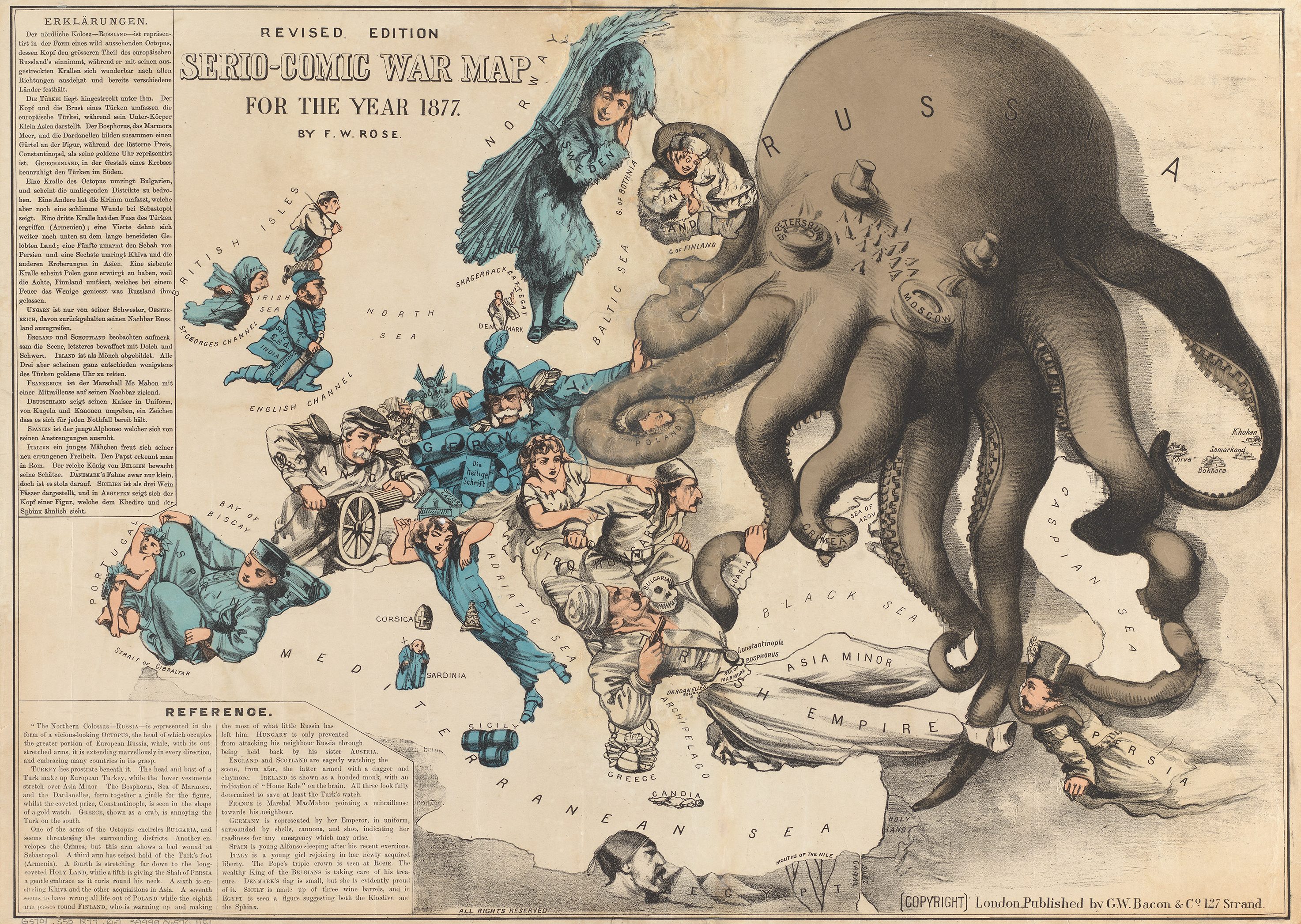
The exhibition begins with examples of maps designed to influence others, from innocuous advertising to persuasive cartography (maps designed to push a particular viewpoint) and outright propaganda. It then explores visualization techniques that have been used, in some cases for centuries, to support specific interpretations of geographic information. A cartographer’s choice of colors, icons, and map orientation can lead viewers to see the world in very different ways.
The exhibition’s final section explores the themes of power, trust, and belief. We commissioned five cartographers to create maps of Massachusetts using a curated data set provided by the map center. For this section of the show, titled “Same Data, Different Stories,” we asked each cartographer to create two maps that would illustrate how the same data could be used to support different headlines.
Here’s a sampling of objects from the show, which can be viewed in full here. When the Boston Public Library reopens, the exhibition will be on display at the map center, a nonprofit organization established in 2004 by the library and Norman B. Leventhal ’38, a real estate developer, philanthropist, and avid map collector. (Exhibition dates and times will be announced on the Leventhal Map and Education website.)
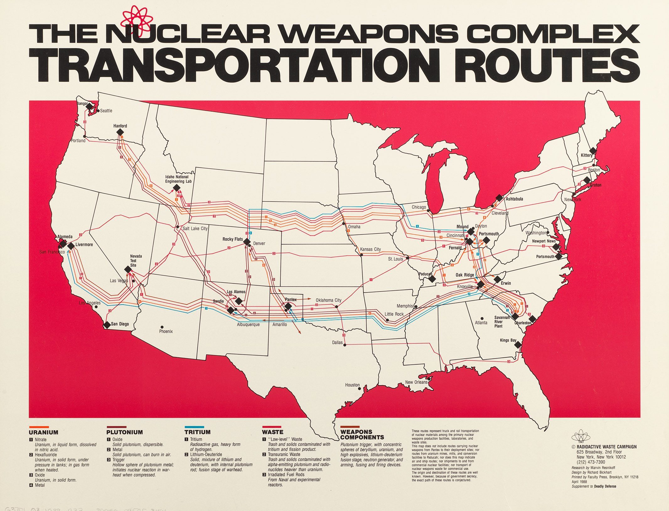
Nuke routes
This map is from the “Why Persuade?” section of the show and was produced in 1988 by the Radioactive Waste Campaign with the goal of sounding the alarm about the danger of nuclear weapons. By visualizing the transportation routes of nuclear materials, the map seeks to portray a nationwide threat. The mapmaker borrowed the visual technique of a flow map, using route lines to show the direction of movement and color-coding them according to the type of material being transported. However, spacing out the lines gives viewers the impression that vast swaths of the country are in the path of nuclear weapon components. For example, one single route in South Carolina is outlined by nine different lines and covers more than half the state.
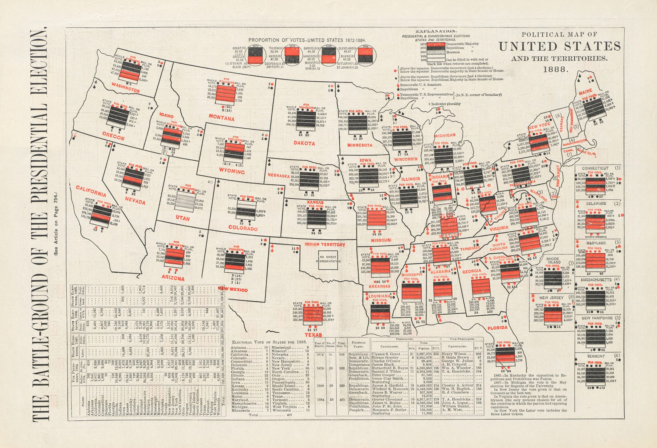
Counting up votes
Since the late 19th century, mapmakers have experimented with various graphic techniques for displaying presidential election results. This map is one of the earliest and most complex attempts, published in anticipation of the 1888 election between Republican Benjamin Harrison and Democrat Grover Cleveland.
Each bar in the stacks of bars in each state represents a previous election year and is colored to show which party held the presidential majority (black for Republicans, red for Democrats). Dots convey even more information, including the party affiliations of the state senators, state representatives, and governor, as well as which party holds the majority in each state legislative body.
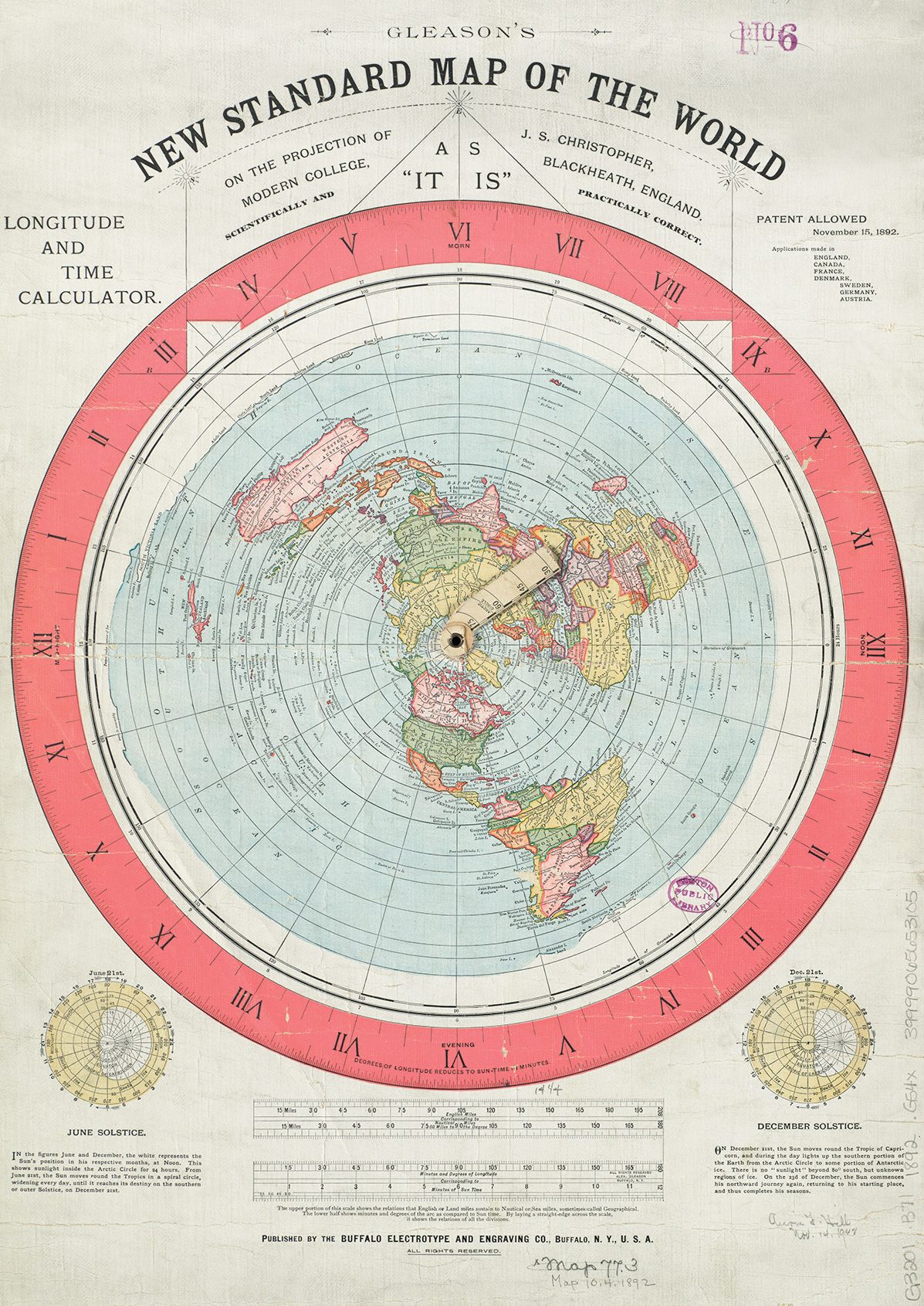
The round earth as a flat-out lie
This map provides an interesting modern tale about the role of institutions in constructing the truth. The cartographer created and patented it in 1892 to support his notion that the earth was not a sphere. Soon after the Leventhal Map & Education Center added this map to its digital repository and referenced it as a flat-earth map, in 2015, it quickly became one of the center’s most-accessed online items.
For present-day believers in the flat-earth theory, the fact that this “standard” map exists in the holdings of a prestigious and historic public library is viewed as evidence of its veracity: why else would the library have a map that shows a flat earth “as it is”? Its popularity reflects a confusing combination of trust in maps and respect for institutions with a complete disregard for science and scholarship.
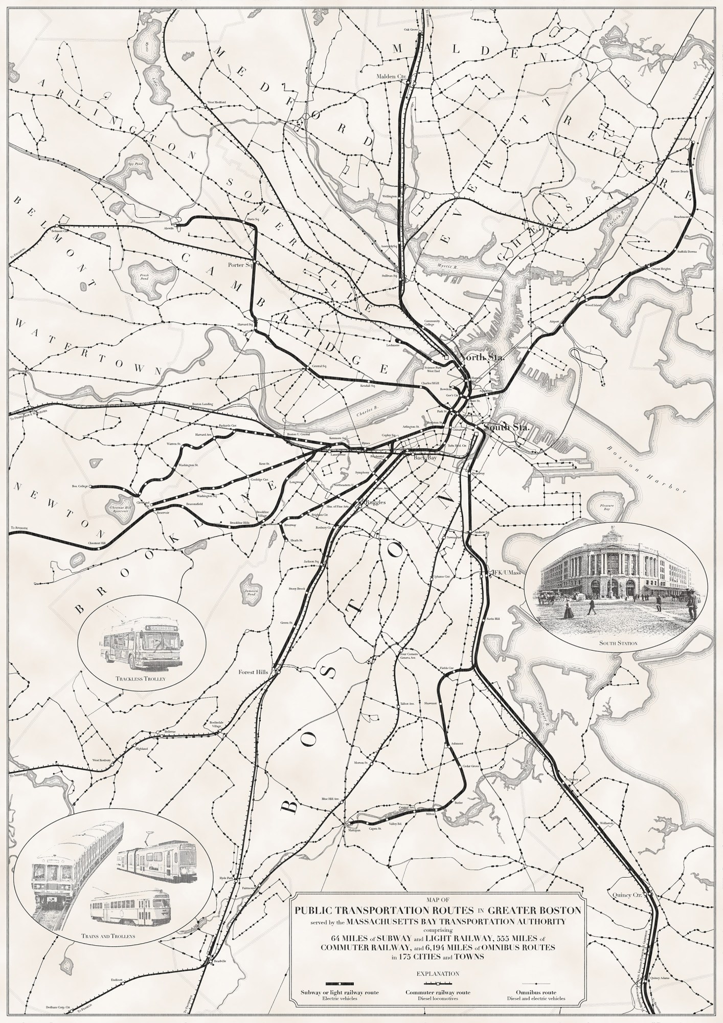
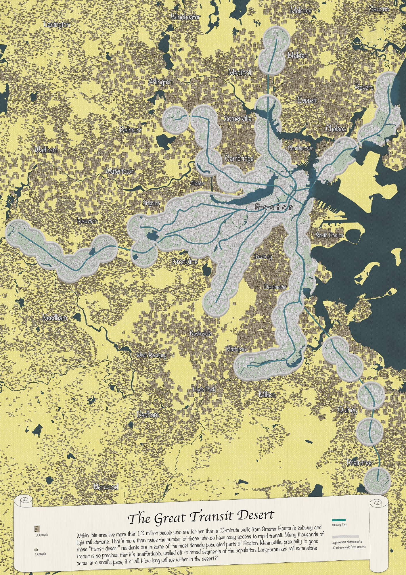
Two tales of transit
For the “Same Data, Different Stories” section of the exhibit, cartographer Andy Woodruff created two maps of public transportation routes in Greater Boston. The top map includes subway, light rail, and bus routes, depicting a dense and extensive public transit network in a deliberately crowded map. The other emphasizes areas lacking transit coverage by including only subway lines, adding population data, and employing a dramatic desert motif to highlight the miserable conditions far away from subway stations.
Keep Reading
Most Popular
Large language models can do jaw-dropping things. But nobody knows exactly why.
And that's a problem. Figuring it out is one of the biggest scientific puzzles of our time and a crucial step towards controlling more powerful future models.
How scientists traced a mysterious covid case back to six toilets
When wastewater surveillance turns into a hunt for a single infected individual, the ethics get tricky.
The problem with plug-in hybrids? Their drivers.
Plug-in hybrids are often sold as a transition to EVs, but new data from Europe shows we’re still underestimating the emissions they produce.
Stay connected
Get the latest updates from
MIT Technology Review
Discover special offers, top stories, upcoming events, and more.