The Website That Visualizes Human Activity in Cities Across the World
The data from mobile phones is revolutionizing our understanding of human activity. In recent years, it has revealed commuting patterns in major cities, wealth distribution in African countries, and even reproductive strategies in western societies. That has provided unprecedented insight for economists, sociologists, and city planners among others.
But this kind of advanced research is just a first step in a much broader trend. Phone data is set to become a standard resource that almost anyone can use to study and watch humanity continuously, much as they can now watch the weather unfold anywhere on the planet almost in real time.
But one thing is holding them back—the lack of powerful computational tools that can gather, crunch, and present the data in meaningful ways.
Today, that looks set to change to the work of Dániel Kondor and a few pals at the SENSEable City Laboratory, part of MIT, and at Ericsson, a company that produces network infrastructure technologies. These guys have unveiled a powerful online tool that uses mobile phone data to visualize human activity in cities all over the world.
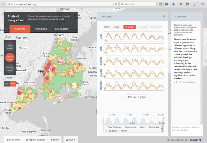
This new tool, called ManyCities, allows anybody to study human activity in various cities with unprecedented detail. But the key is that it organizes and presents the data in intuitive ways that quickly reveals trends and special events.
Kondor and co show off their new toy by gathering mobile phone data from base stations across the cities of Los Angeles, New York, London, and Hong Kong between April 2013 and January 2014. The data includes the number of calls placed, the number of text messages sent, the amount of data downloaded and uploaded and the number of data requests at 15-minute intervals.
“The aggregated data does not include any sensitive customer information, but provides enough detail about the typical usage patterns on the scale of small neighborhoods,” say Kondor and co.
ManyCities then presents the data in three simple ways. The first shows how phone usage varies over time, revealing clear daily and weekly patterns as well as longer term trends. For example, ManyCities clearly shows a steady, long-term increase in data traffic, the effect of holidays, and how usage patterns change dramatically during important events like the Wimbledon tennis championship in London.
ManyCities also allows user to drill down into the data to compare patterns in different neighborhoods or in different cities. It shows, for example, that text message activity peaks in the morning in Hong Kong, in the evening in New York and at midday in London.
It also shows a peak in data usage in the evening in New York and Hong Kong. However, data usage plummets in the evening in London. “We speculate that [this] is the effect of cellular data traffic being especially expensive in London, prompting people to switch to much cheaper Wi-Fi networks when at home,” say Kondor and co.
ManyCities also shows how activity clusters in different parts of cities and by analyzing these clusters, it classifies them as residential or core business areas. This allows a detailed comparison of activities in cities in different parts of the world. Kondor and co say a remarkable finding of theirs is that while the activity in different business areas is similar, the activity in residential areas is much more variable. Just why isn’t yet clear.
The final way of representing the data is by sheer volume. This reveals the most active parts of a city and how this varies over time as well as allowing comparisons across the world.
That’s interesting work that provides an important insight into how mobile phone data is set to become a valuable resource for all kinds of users. Kondor and co have made it available at www.ManyCities.org for anybody to try.
This kind of tool is clearly evolving into a real time analytics tool. It’s not hard to imagine how people could use it to plan events such as conferences, sporting contests, or concerts or to plan emergency city infrastructure. One day people may even tune in to a “smartphone forecast” to find out if their phone will work when the big game kicks off that evening.
Ref: arxiv.org/abs/1509.00459 : Visualizing Signatures Of Human Activity In Cities Across The Globe
Keep Reading
Most Popular
Large language models can do jaw-dropping things. But nobody knows exactly why.
And that's a problem. Figuring it out is one of the biggest scientific puzzles of our time and a crucial step towards controlling more powerful future models.
How scientists traced a mysterious covid case back to six toilets
When wastewater surveillance turns into a hunt for a single infected individual, the ethics get tricky.
The problem with plug-in hybrids? Their drivers.
Plug-in hybrids are often sold as a transition to EVs, but new data from Europe shows we’re still underestimating the emissions they produce.
Stay connected
Get the latest updates from
MIT Technology Review
Discover special offers, top stories, upcoming events, and more.