Data Browser Shows Changes in the Electricity Fuel Mix
Even people with a passing interest in energy know there have been major changes in the U.S. over the past few years, including the surge in domestic oil and natural gas drilling and a jump in renewable energy.
How do these broader trends play out in electricity generation in the U.S.? The Energy Information Administration last week released its electricity data browser, which lets you view how fuels for electricity generation have shifted over the past decade.
There’s something in it for Web developers as well, as this information is available from an API. It’s part of the Department of Energy’s efforts to publish more publicly available information to spur innovation and the creation of applications using energy data. (See, Inventing the Cleanweb.)
First off, what’s the demand for electricity like? When you look at net generation data for electric utilities (this excludes independent power producers and co-gen facilities), you see a clear trend: flat to negative load growth. If you look at the “all fuels” red line below, you can see a dip in 2009 from the recession, which is to be expected. The number of electric gadgets U.S. homes have is growing, but overall usage is fairly steady, likely in part due to more efficient lighting and large appliances.
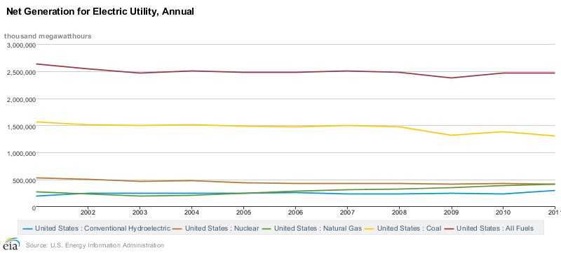
This slow or no growth environment means that the days of building a giant nuclear plant in the U.S., for example, to meet rapid growth appear to be in the past. It also means a rise in one fuel source use corresponds to a drop in another.
The rush of natural gas, due to fracking shale rock in the U.S., has been the biggest energy story of the past few years and the effects are quite clear in this next chart below. The annual data, indexed to 2001, show how much each fuel (minus pumped hydro and the “other” category) has contributed over time.
We see natural gas (the yellow line) shoot up over the past few years and coal going down (the red line)—a visual demonstration of utilities opting for cheap and cleaner-burning natural gas over coal.
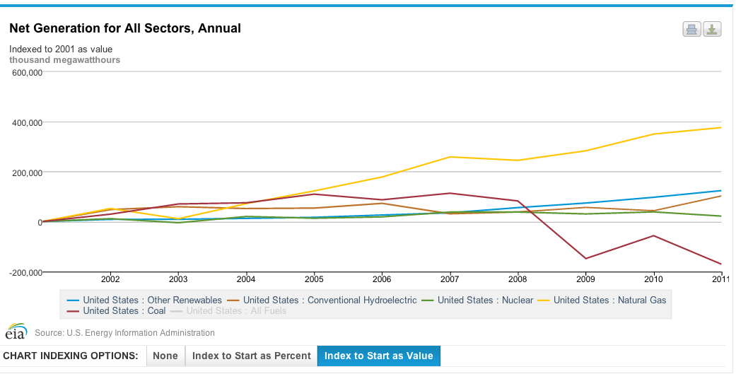
The last graph showed that nuclear and hydropower have contributed roughly the same amount to overall electricity generation over the past decade. But what about the upward “other renewables” line? That includes biomass, or burning wood for power generation, along with geothermal, wind, and solar.
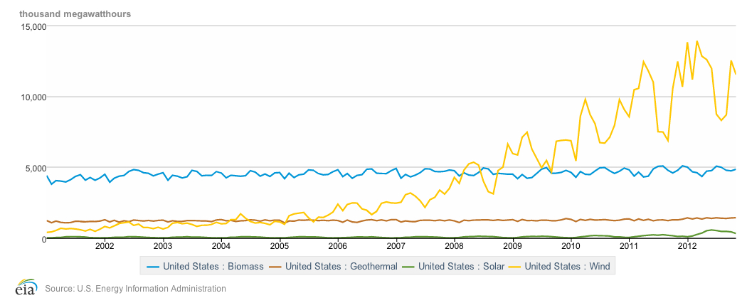
This next chart below shows just much wind has grown over the past five years in the U.S. It displays monthly data, which reflects how wind output varies substantially with the time of the year, unlike nuclear or fossil plants which can run steadily. The contribution of biomass and geothermal are fairly consistent over the years, while solar has started to creep up since the mid-2000s. (Note this is for megawatt-hours of energy produced, not the power capacity of wind and solar installations.)
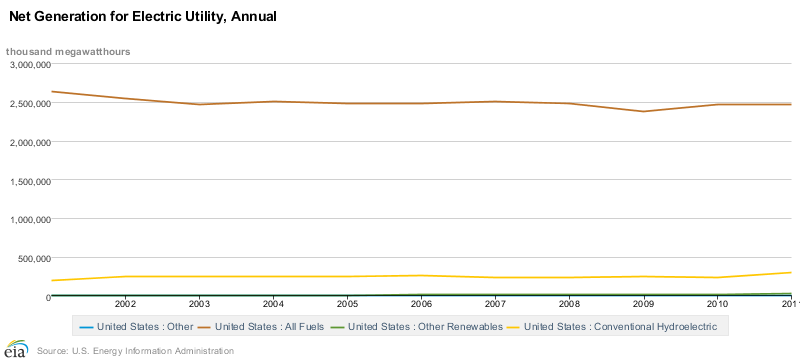
To put the growth of wind and solar in perspective, look at this next chart below. The top brown line is all generation for electric utilities compared to hydropower and other renewables. As you can see, non-hydropower renewables (the green line at the borrom) still remain a tiny portion of the overall generating mix despite rapid growth over the past few years.
Keep Reading
Most Popular
Large language models can do jaw-dropping things. But nobody knows exactly why.
And that's a problem. Figuring it out is one of the biggest scientific puzzles of our time and a crucial step towards controlling more powerful future models.
How scientists traced a mysterious covid case back to six toilets
When wastewater surveillance turns into a hunt for a single infected individual, the ethics get tricky.
The problem with plug-in hybrids? Their drivers.
Plug-in hybrids are often sold as a transition to EVs, but new data from Europe shows we’re still underestimating the emissions they produce.
Stay connected
Get the latest updates from
MIT Technology Review
Discover special offers, top stories, upcoming events, and more.