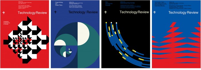
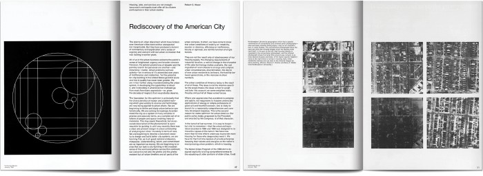
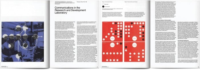
MIT has long been celebrated for its leadership in engineering and technological innovation, but few outside of design circles know it was also a pioneer in American graphic design. Led in the 1950s by legendary designers Muriel Cooper and Jacqueline Casey, the MIT Office of Design Services developed an aesthetic that synthesized International Style typography, Bauhaus vanguardism, and American hard-edge abstraction. The distinctive form language they developed defined the look of MIT publications (including this one) for decades and inspired a generation of designers.
Layouts created in the 1960s for Technology Review
So it seemed only fitting that we approach MIT Technology Review’s redesign by appropriating the best ideas from our past and updating them for modern media. The new format, created in partnership with Michael Bierut and Aron Fay of the renowned global design firm Pentagram, extends the tradition of graphic invention begun by Cooper, Casey, and their collaborators and grounds it in a precise, systems-driven logic that can be applied to print, screen, and environmental graphics.
Advertisement
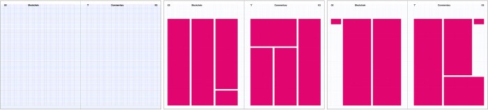
A flexible 12-column grid organizes type and graphic elements. The generous margin at the top of the page
pays homage to the magazine’s midcentury designs
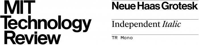
For decades, Helvetica was the only typeface used in Technology Review headlines. So when we began considering fonts for the redesign, Christian Schwartz’s Neue Haas Grotesk, a meticulous digital restoration of Helvetica’s original designs, was the clear choice for the magazine’s new logo and story headlines. Body text is now set in Independent, a beautifully realized typeface created (for Britain’s Independent newspaper) specifically to offer legibility at a wide range of sizes. Complementing these is a new, custom-designed typeface called TR Mono that infuses the nitty-gritty bits—captions, sidebars, and information graphics—with style and character. This carefully curated set makes our typography legible, easy to use, and consistent across all media.
This story is only available to subscribers.
Don’t settle for half the story.
Get paywall-free access to technology news for the here and now.
The refined logo (left) and the new typographic palette
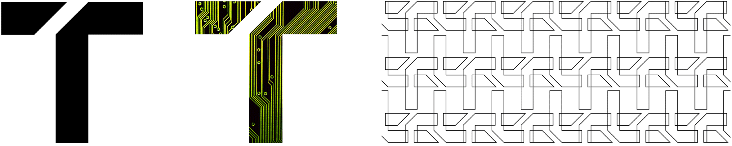
We also have a new monogram: a stylized capital T—with a strategically placed 45-degree slash that slyly evokes a lowercase r—that will serve as the company’s avatar at a wide range of sizes, formats, and resolutions. This simple, durable mark is immediately recognizable, and also amenable to endless adaptation, repetition, and recontextualization; it can become a container for images, a tessellated pattern, and more. The 45-degree slash on its own will also serve as a recurring decorative motif throughout all our designs.
The monogram can be animated or used as the basis for decorative patterns (top). The 45-degree angle recurs
throughout the magazine.
Rob Larson / Winni Wintermeyer
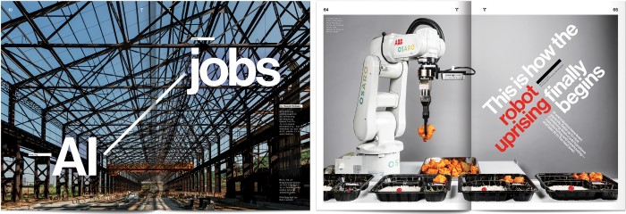
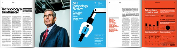
But perhaps the most noticeable change will be seen in our approach to using imagery—vivid, dramatic, and in some cases startling—to illustrate narrative, elicit wonder, and convey emotion in our stories.
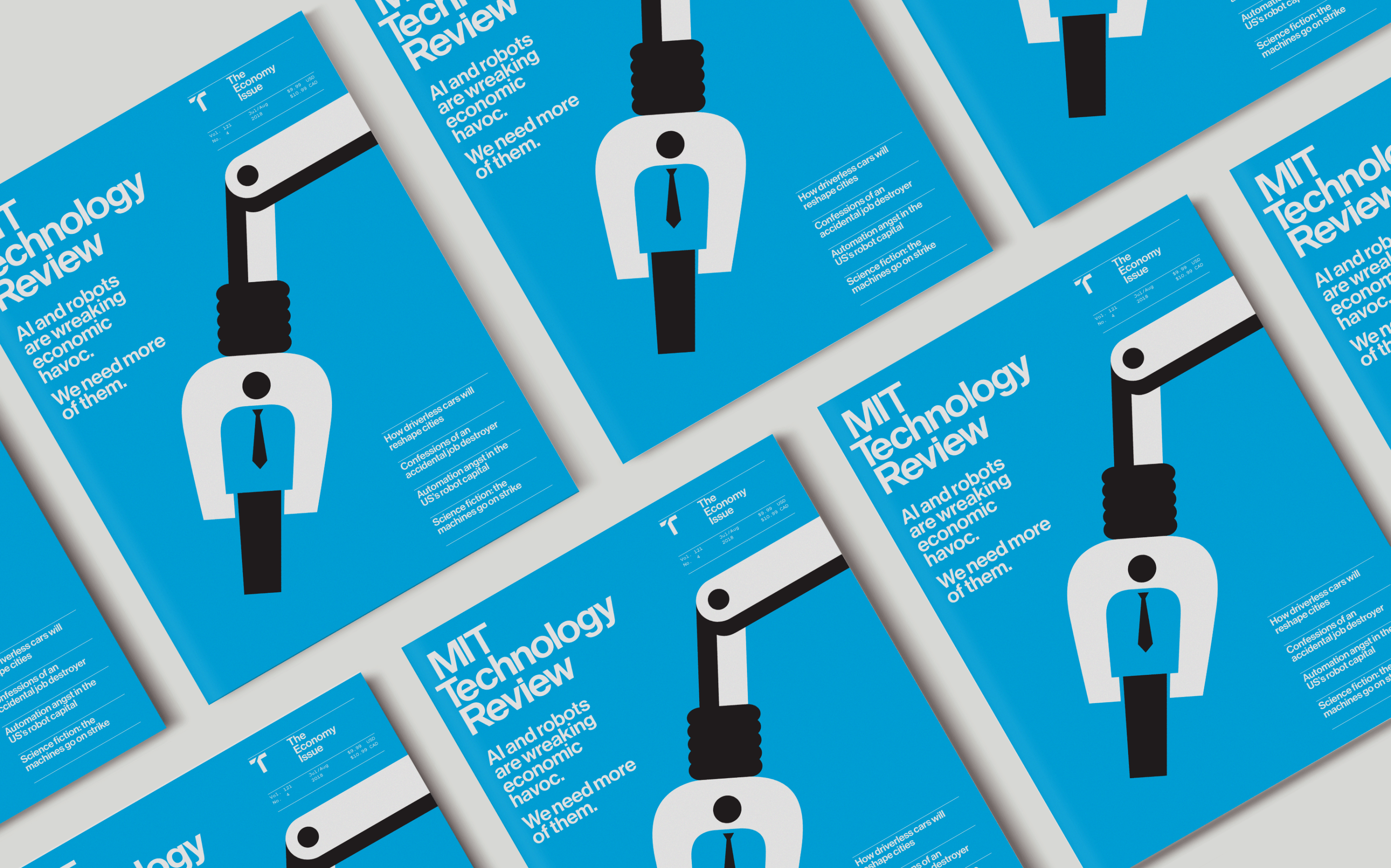
There is a new emphasis on photography, which will give our readers a sense of intimate access to people, places, and devices otherwise out of reach. Our illustrators will work in a consistent graphic style, commenting on and speculating about the human implications of emerging technologies. And infographics—a signature piece of our new format—will use bold colors and simple, dramatic graphical elements to make data visualization into a compelling form of narrative journalism.
Examples of our new approach to photography, illustration, and information graphics
Christie Hemm Klok / Noma Bar
Fifty years ago, this institution occupied a place at the vanguard of American graphic design. With this redesign, we intend to honor—and aspire to reclaim—that heritage.