In 1973, the statistician Francis Anscombe devised a fascinating demonstration showing why data should always be plotted before it is analyzed. The demonstration consisted of four data sets that had almost identical statistical properties. By this measure they are essentially the same.
But when plotted, the data sets look entirely different. Anscombe’s quartet, as it has become known, shows how good graphics allow people to analyze data in a different way, to think and talk about it on another level.
Advertisement
Most scientists recognize the importance of good graphics for communicating complex ideas. It’s hard to describe the structure of DNA, for example, without a diagram.
This story is only available to subscribers.
Don’t settle for half the story.
Get paywall-free access to technology news for the here and now.
And yet, there is little if any evidence showing that good graphics are an important part of the scientific endeavor. The significance of good graphics may seem self-evident, but without evidence, it is merely a hypothesis.
Today, that changes thanks to the work of Po-shen Lee at pals at the University of Washington in Seattle who have used a machine-vision algorithm to search for graphics in scientific papers and then analyze and classify them. This work reveals for the first time that graphics play an important role in the scientific process. “We find a significant correlation between scientific impact and the use of visual information, where higher impact papers tend to include more diagrams, and to a lesser extent more plots and photographs,” they say.
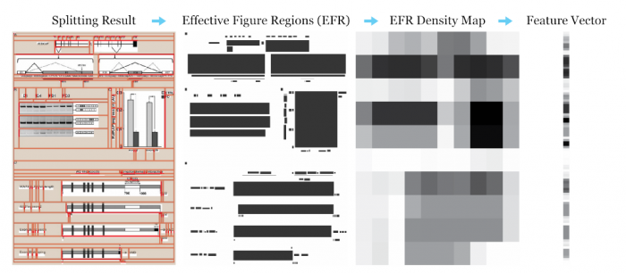
These guys begin by downloading 4.8 million figures from 650,000 scientific papers from the online database PubMed Central, which hosts papers mainly from the life sciences and biomedicine. Lee and co then trained a machine-vision algorithm to divide multichart figures into its component parts. This increased the database to some 10 million figures for analysis, 67 percent of them coming from the multichart figures.
The team then taught to the algorithm to recognize five different types of figure: diagrams, photos, tables, data plots, and equations. The most common turns out to be data plots, which make up 35 percent of the total, followed by photos (22 percent), diagrams (20 percent) and equations (17 percent). Tables make up only 5 percent of the database.
Next, the researchers analyzed how this distribution varied by journal, by discipline, and over time. “We find that the distribution of figures and figure types in the literature has remained relatively constant over time, but can vary widely across field and topic,” they say.
But their most remarkable discovery is that the most successful papers tend to have more figures. By plotting the number of diagrams in a paper against its impact, the team concludes that high impact ideas tend to be conveyed visually.
Lee and co say there are two possible explanations for this: “That visual information improves the clarity of the paper, leading to more citations, and higher impact, or that high impact papers naturally tend to include new, complex ideas that require visual explanation.”
Advertisement
There’s work ahead of course. Lee and co are well aware of PubMed Central’s bias toward the life sciences and biomedicine. So an obvious next step is to include diagrams from the physical sciences. The Physics arXiv is an obvious resource to exploit.
The team also wants to explore the properties of different data representations. Their goal is to study how successfully different types of diagram convey information, producing some evidence that might turn the black art of diagram design into a science.
That is interesting work that provides the foundation for an entirely new kind of science. The team calls this “viziometrics,” the science of visual information. This mirrors bibliometrics, which is the statistical study of publications, and scientometrics which is the study of measuring science.
The works leaves an important legacy. Lee and co have made their database searchable and available at www.viziometrics.org. It makes for interesting browsing—enter a scientific term and the search engine returns a wide range of diagrams, photos and so on, related to that theme.
That allows scientists to search scientific literature on a different level of abstraction. In other words, it allows them to reason about science and data in a new way. This is surely a powerful new tool and one that could have a profound impact on the way we produce, search for and access scientific information. Anscombe would surely be amazed.
Ref: arxiv.org/abs/1605.04951: Viziometrics: Analyzing Visual Information in the Scientific Literature