The covid-19 pandemic in two animated charts
Note: This article was updated on April 21, 2020
The United States has just reached an unwanted milestone in the coronavirus pandemic: it now has more than 40,000 confirmed deaths from covid-19, far in excess of any other country. Although more people have died from the disease in other countries earlier in the outbreak—first China, then Italy were considered the centers of the disease—the world's third-largest country is hosting by far the world’s largest outbreak.
You can read all our coverage of the coronavirus/Covid-19 outbreak for free, and also sign up for our coronavirus newsletter. But please consider subscribing to support our nonprofit journalism.
There are continuing arguments about how accurate these numbers are, not least because different testing regimes across the world mean that the number of undetected cases varies wildly from nation to nation. But the reality is that case numbers in the US could be far higher than reported, too: on March 6 Vice President Mike Pence announced that 3 million tests would be available “by next week“; the Atlantic’s Covid tracking project so far estimates that it took until April 14 for that many tests to actually be administered.
So what does this actually look like?
Most of the graphs produced to track the disease so far have shown the growth in cases and fatalities on either a linear scale (which plots data along a fixed axis and is useful for seeing the raw increase in incidents) or a logarithmic one (which plots its data on an exponential scale, and is used by epidemiologists to monitor the rate at which outbreaks are growing).
Here is a visualization, based on the same data used by Johns Hopkins to produce its dashboard, that shows growth in the number of cases over time in animated form. Just hit the Play button at the bottom left to see the situation evolve over time. Note: the data are accurate until April 21.
What becomes clear here is that China’s tens of thousands of cases rocketed in the early weeks of the disease, but tailed off before almost any other significant outbreaks had happened. Explosive growth in case numbers in Italy and Spain—and then in the US, where cases far exceed other nations—took place only once China’s outbreak had stabilized.
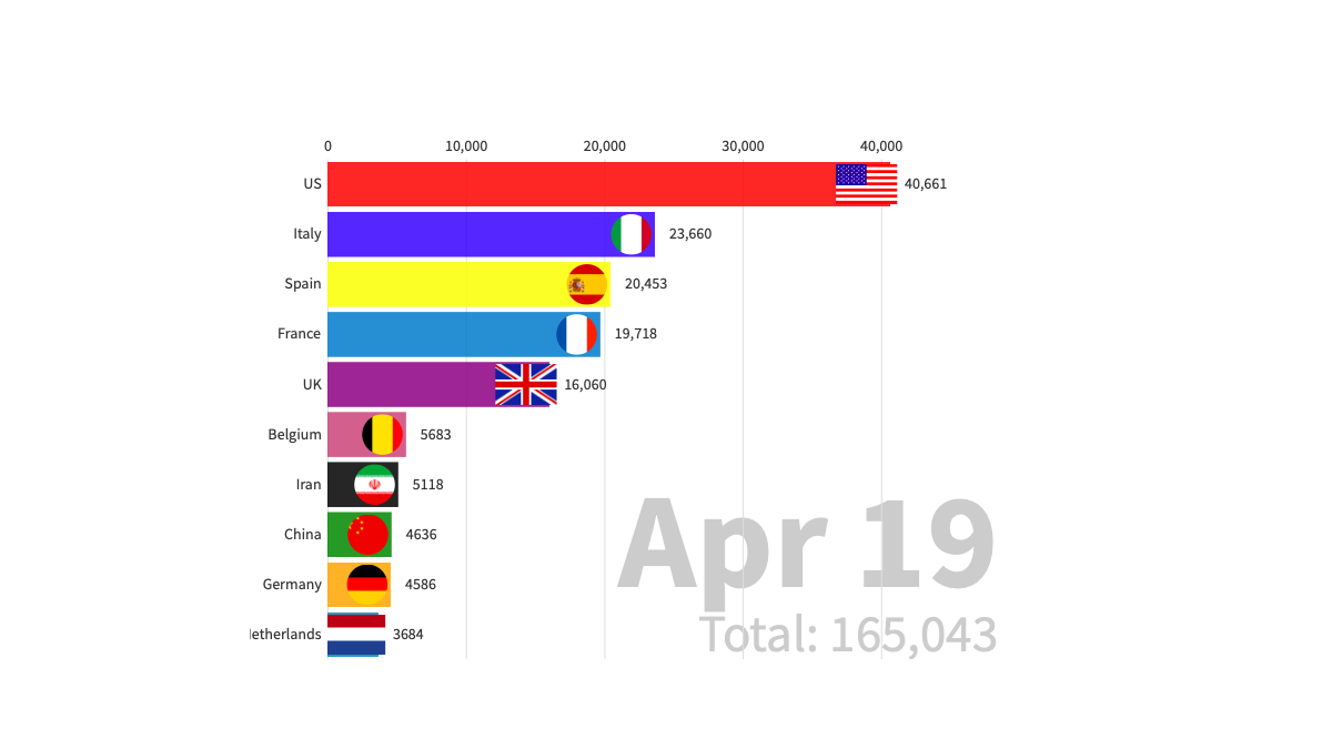
And here is the same approach looking at an even more stark set of figures: the number of fatalities.
China’s large number of deaths again slows down before outbreaks elsewhere start claiming lives. Italy’s total was less than 100 on March 3; by March 28, it had passed 10,000. The US then accelerates to meet Italy's total at around 18,000 deaths on April 10; by April 19 it has broke through the 40,000 fatalities mark.
Sources: JHU CCSE.
Deep Dive
Biotechnology and health
How scientists traced a mysterious covid case back to six toilets
When wastewater surveillance turns into a hunt for a single infected individual, the ethics get tricky.
An AI-driven “factory of drugs” claims to have hit a big milestone
Insilico is part of a wave of companies betting on AI as the "next amazing revolution" in biology
The quest to legitimize longevity medicine
Longevity clinics offer a mix of services that largely cater to the wealthy. Now there’s a push to establish their work as a credible medical field.
There is a new most expensive drug in the world. Price tag: $4.25 million
But will the latest gene therapy suffer the curse of the costliest drug?
Stay connected
Get the latest updates from
MIT Technology Review
Discover special offers, top stories, upcoming events, and more.