Fishing for meaning in a sea of data

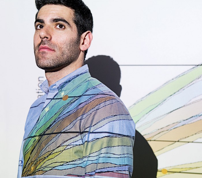
A curving line slides across his face as David Reshef ’08, MEng ’09, PhD ’17, steps in front of the projector in a Broad Institute seminar room. On the screen is a stack of graphs, some mapping out crisp lines while others show thick bands of dots approximating a slope or a parabola.
The graphs illustrate how a tool Reshef developed with his brother, Yakir, identifies and ranks different kinds of relationships in a large data set. For those who grapple with vast amounts of data, the tool offers an exciting way to essentially compare apples and oranges. Because it can find virtually any kind of association between pairs of variables—rather than focusing only on well-understood relationships such as linear or exponential ones, for example—the tool can reveal unexpected correlations. And because it can rank different kinds of relationships by strength, it can show researchers where to look for meaning in a sea of data. On the screen, thin lines and crisp curves rise to the top, while the blurrier forms—representing weaker relationships—fall to the bottom.
Genomics researchers could be ideal users for this tool—and there are plenty at the Broad, where an entire human genome is sequenced every 12 minutes. As the brothers joke and tag-team their way through a presentation of their research, their smooth explanations make its logic seem obvious. But they’ve already spent a decade working to figure out how to analyze this kind of information.
The Reshefs grew up in Israel and Kenya, where their parents—a physician and an epidemiologist—worked in global health. The family settled in Maryland when David was eight, and the boys soon became enamored of computer science. David had always planned to go into medicine, and while pursuing electrical engineering and computer science at MIT, he studied the dynamics of disease transmission. From HIV to cholera, every disease had a data set with its own unique features.
When swine flu popped up across the United States in 2009, David joined a team of Harvard public health researchers in Milwaukee, one of the hardest-hit cities. He sifted through handwritten records at a local health department, feeding incoming data into computational models to try to understand how fast the disease was spreading so health professionals could respond.
Researchers needed tools that could analyze an entire data set and flag the strongest relationships—tools that could help generate hypotheses.
Meanwhile, he realized that while researchers had access to much more data and computational power than they had in the past, that was a mixed blessing. They could now identify relationships between variables—and even relationships between relationships—at a much more granular level, but the sheer volume and complexity of the data made doing that exceptionally hard.
What they needed, Reshef started to think, were statistical tools that could analyze an entire data set and flag the strongest relationships—tools that could help generate new hypotheses. Instead of always having to anticipate what’s worth examining, researchers could use such tools to zero in on the most interesting questions to ask.
The problem, he says, was how to “develop tools that help us find things we don’t necessarily anticipate in the data.”
In a 2011 Science paper, the brothers described a new approach in the form of what they call maximal information-based nonparametric exploration (MINE) statistics. Their tools, developed in collaboration with Pardis Sabeti and Michael Mitzenmacher of Harvard, are motivated by a simple idea: if we want to look for patterns where there may be many types of relationships at play, we need a way to identify which are real, and which are strongest. One of the tools, called the maximal information coefficient (MIC), detects dependence, or the existence of nonrandom relationships, between pairs of variables. It also ranks those relationships by their strength, based on how “noisy” they are. A perfect correlation (imagine a crisp line or a parabola on a graph, with no stray points) would rank highest, followed by relationships including more data points that don’t fit the dominant shapes or lines. Completely unrelated variables (think of a graph full of random points) would fall to the bottom of the list.
When the Reshefs applied MIC to a 357-variable data set from the World Health Organization, it revealed two relationships between income and female obesity. Obesity was low among impoverished women, rose with income to a certain point, and then dropped again at upper income levels. (This wasn’t surprising: women who can’t afford food aren’t likely to be obese, and neither are women who can afford the healthiest diets.) But there was also a striking spike at low income levels that turned out to account for women of Pacific Island nations where obesity is culturally valued. Although public health officials already knew about this regional trend, the result illustrated how the tool can capture statistical relationships that don’t fit an otherwise predictable pattern.
MINE can be used to explore any data set that has so many variables the individual relationships between them can’t be evaluated manually. When the brothers used their tools to analyze the 131 variables in a 2008 data set from Major League Baseball, for example, they identified the three most strongly associated with players’ salaries: hits, total bases, and the somewhat arcane stat known as “replacement level marginal lineup value” (an estimate of how many more—or fewer—runs per game a player contributes than a statistically average replacement player at the same position). While none of these is particularly surprising, they rose to the top of a long list of variables that all made sense. Another model that considers only linear relationships—and doesn’t compare different kinds of relationships—came up with an entirely different top three.
The Reshefs also used MINE to identify 9,472 significant relationships—out of some 22 million possibilities—between different species of gut bacteria. Many could be explained by well-understood factors like diet and host sex. But after ruling those out, they were left with 188 strong, unexplained relationships that might merit further study: they could suggest competition between bacterial species or point to other factors that shape the ecology of gut microbiota, which can affect overall health. Microbiome researchers have continued to use the tools to untangle relationships between different gut bacteria.
Likewise, the brothers’ tools could be used to make sense of the growing flood of gene expression data. For example, by measuring the activity of each of our roughly 20,000 genes, MINE could help uncover relationships that would lead to a clearer picture of what distinguishes normal from pathological cell behavior.
Having developed tools at the intersection of statistics and machine learning, David is now eager to develop ways to use machine learning for biological research. Ultimately, he says, it can help us learn from our data as efficiently as possible. “It’s going to be incredibly exciting to explore,” he says.
Keep Reading
Most Popular
Large language models can do jaw-dropping things. But nobody knows exactly why.
And that's a problem. Figuring it out is one of the biggest scientific puzzles of our time and a crucial step towards controlling more powerful future models.
The problem with plug-in hybrids? Their drivers.
Plug-in hybrids are often sold as a transition to EVs, but new data from Europe shows we’re still underestimating the emissions they produce.
How scientists traced a mysterious covid case back to six toilets
When wastewater surveillance turns into a hunt for a single infected individual, the ethics get tricky.
Google DeepMind’s new generative model makes Super Mario–like games from scratch
Genie learns how to control games by watching hours and hours of video. It could help train next-gen robots too.
Stay connected
Get the latest updates from
MIT Technology Review
Discover special offers, top stories, upcoming events, and more.