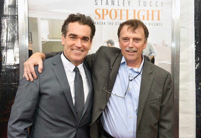
It’s not often that a spreadsheet has an important role in a movie. But a spreadsheet does indeed get its big-screen debut in the movie Spotlight, which recently won the Oscars for Best Picture and Best Original Screenplay. The movie, and that scene-stealing spreadsheet, have helped renew interest in investigative and data-driven reporting.
Personally, I’m delighted. It’s my spreadsheet. I made it while working as one of the investigative journalists on the Boston Globe’s Spotlight Team. For those who haven’t seen the movie, it tells the story of how our team—which also included Sacha Pfeiffer, Michael Rezendes, and our leader, Walter “Robby” Robinson—peeled back layers of secrecy to prove that the Boston Catholic archdiocese had been covering up the abuse of children by priests for decades. As the movie shows, the tool the team built to organize data on priests suspected of abuse was a key part of that effort.
Our first story ran in January 2002. Over the course of that year, our team and other reporters at the Globe wrote more than 600 stories about the abuse crisis. The outcome was far more explosive than we ever expected. Within a few months of our first story, similar tales of abuse were uncovered by reporters around the world. More than a decade later, the impact is still echoing across the United States. In March, a grand jury in Altoona, Pennsylvania, reported that the diocese had covered up the abuse of hundreds of children by priests.
Thousands of children around the country had been abused through the years; we were happy that our stories and those of others led so many survivors to receive help in the form of counseling or financial aid. Our stories also won the 2003 Pulitzer Prize for Public Service.
When my former colleagues and I watch Spotlight, it’s a bit surreal to see “ourselves” on the screen. But as flattering as it is to be portrayed by the handsome Broadway actor Brian d’Arcy James, the best part of the movie for me is the spreadsheet scene. Those few minutes capture the tedium and hard work that often make up investigative journalism, as well as the shock when we realized that perhaps the problem went much deeper than we’d first suspected. (That initial list contained nearly 100 names of priests we considered suspects, most of whom turned out to be abusers.)
There was nothing fancy about our spreadsheet. It had maybe a thousand or so rows. (I wish I still had the original, but it disappeared three or four laptops ago.) Both before and after that story, I did data work that was much more complicated and interesting from a professional point of view. Yet nothing else I’ve done came close to having the impact of that simple spreadsheet. Just because the data is simple doesn’t mean it can’t have major implications. It’s a lesson I’ll never forget.
While I’ve left investigative work mostly behind me, I often share that lesson with the students and journalists I now work with in my role at MIT. For the past two years I’ve led the Future of News initiative, which is part of Ethan Zuckerman’s Center for Civic Media at the MIT Media Lab. We run conferences that address major issues facing journalism, such as how to create civil commenting cultures online or how to tame content management systems. And I work directly with students to help create tools for newsrooms, such as FOLD.cm, a platform for contextualized storytelling, and NewsPix, a browser extension that presents a stream of news photos when users open a new tab.
I’m excited about what I see in newsrooms today. I recently attended the annual geek journalism conference sponsored by the National Institute for Computer-Assisted Reporting. It’s clear that the role of data journalist is growing—and changing. When I started doing data journalism more than 20 years ago, it was a relatively lonely job. There weren’t that many of us around. But that has changed quickly. In 2008, only 281 journalists went to NICAR. This year, more than 1,000 attended, even though the number of journalists of all kinds is barely more than half what it was in 1990. Sure, part of that growth may reflect how the job has expanded to include creating data visualizations and writing code. But if more of our ever fewer reporters are interested in investigative and data journalism, that can only be a good thing.
After 26 years at the Boston Globe, Matt Carroll became a research scientist at the MIT Media Lab, where he leads the Future of News initiative.
Keep Reading
Most Popular
Large language models can do jaw-dropping things. But nobody knows exactly why.
And that's a problem. Figuring it out is one of the biggest scientific puzzles of our time and a crucial step towards controlling more powerful future models.
How scientists traced a mysterious covid case back to six toilets
When wastewater surveillance turns into a hunt for a single infected individual, the ethics get tricky.
The problem with plug-in hybrids? Their drivers.
Plug-in hybrids are often sold as a transition to EVs, but new data from Europe shows we’re still underestimating the emissions they produce.
Google DeepMind’s new generative model makes Super Mario–like games from scratch
Genie learns how to control games by watching hours and hours of video. It could help train next-gen robots too.
Stay connected
Get the latest updates from
MIT Technology Review
Discover special offers, top stories, upcoming events, and more.