Rich NASA Data Set Reveals a Warming World
NASA yesterday updated its yearly analysis of global surface temperatures, adding measurements from 2012 and reaffirming that the planet is in the midst of a prolonged warming trend. But as Peter Aldhous at New Scientist points out, the rising average temperature for the entire planet is only so illustrative of what’s happening. Much more of the story is contained in local temperature changes, which in some cases are much more dramatic than the global average.
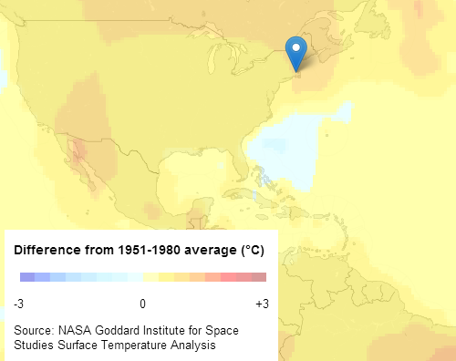
Aldhous and colleagues used data from the NASA analysis reflecting the entire historical temperature record since 1880 to create an informative and smartly interactive map of the world. The visualization uses colors to compare the average surface temperatures for various time frames over the past 120 years to the average temperature during the period from 1951 to 1980, the span the NASA analysis refers to as a baseline. The data combines numbers from thousands of land-based measuring stations with readings from ships and satellites.
Click on a location to view charts showing the warming trend line for that locale compared to the global trend line. Use the dropdown menu at the top to toggle between 20-year time frames going all the way back to 1893.
Keep Reading
Most Popular
Large language models can do jaw-dropping things. But nobody knows exactly why.
And that's a problem. Figuring it out is one of the biggest scientific puzzles of our time and a crucial step towards controlling more powerful future models.
How scientists traced a mysterious covid case back to six toilets
When wastewater surveillance turns into a hunt for a single infected individual, the ethics get tricky.
The problem with plug-in hybrids? Their drivers.
Plug-in hybrids are often sold as a transition to EVs, but new data from Europe shows we’re still underestimating the emissions they produce.
Stay connected
Get the latest updates from
MIT Technology Review
Discover special offers, top stories, upcoming events, and more.