Dig into Election-Day Data
Thanks to massive growth in the popularity of social networks and mobile computing since the last presidential election, Election Day 2012 has been decidedly richer with data, and several websites and news organizations have been collecting and using it to create interesting visualizations.
The numbers that matter the most won’t be tallied until later, but until then, here are few sites that will give you a sense of what’s going on at polling stations around the country.
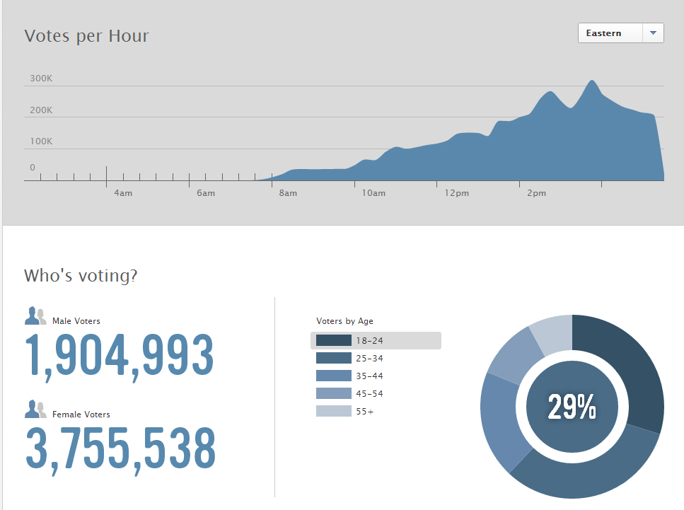
Who is voting and where (according to Facebook)?
Facebook is giving its users the option to press a button to indicate they have voted. The site is also displaying the total number of reported votes per hour, the number of men who said they’d voted to women, and breaking down the age makeup and location of those voters (according to the info they give Facebook). At 5.30 pm (Eastern Time)on Monday women outnumbered men 3.8 million to 1.9 million. Perhaps more women are pressing the button.
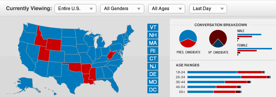
Which candidate is getting the most buzz on the social networks?
Facebook and CNN teamed up during the campaign to create a real-time data visualization page called Election Insights, which is tracking the number of times people are mentioning the names of the candidates on the billion-user social network. Make of it what you will.
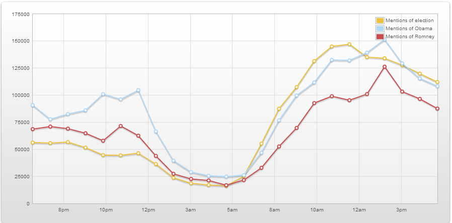
Meanwhile, for Twitter data check out Topsy’s free analytics page for line graph tracking the mentions of specific terms in tweets, as well as the most popular links associated with those terms. You have to enter the terms manually I’m afraid.
Where are the polling problems?
Mother Jones and The Daily Beast have teamed to collect reports of polling place problems, which Mother Jones reporters are then verifying and mapping.
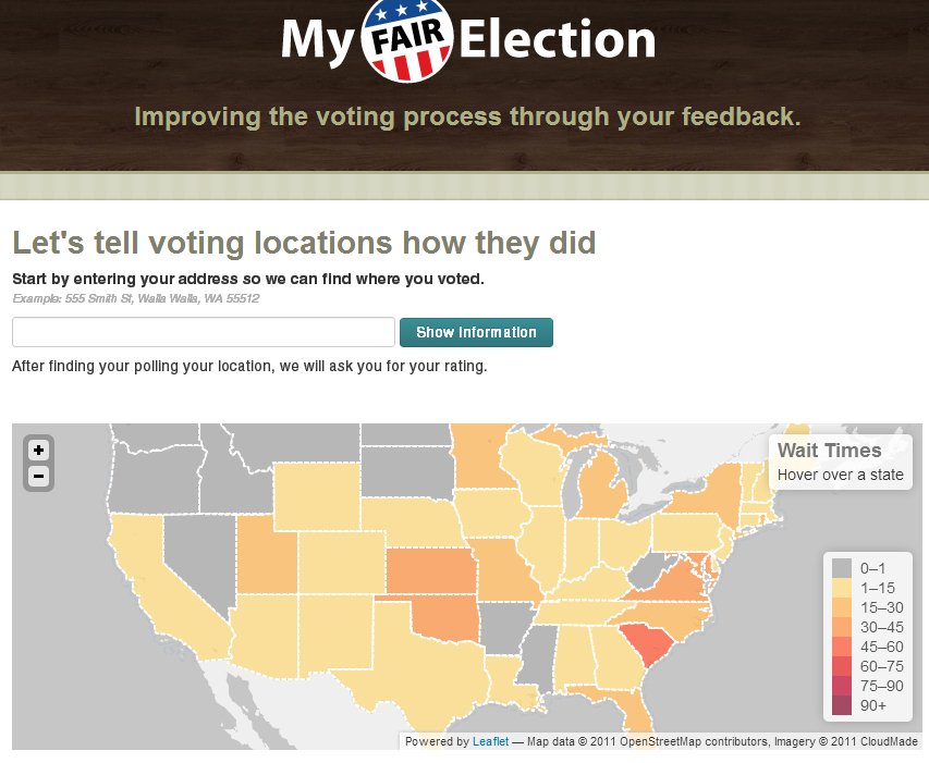
A website called MyFairElection.com also asks users to rate their polling places on a scale of one to five, and to report the time of day they voted and how long they had to wait. Currently the site is showing a map of average wait times by state. South Carolina’s 70 minute average leads the way, but one drawback of the site is that it doesn’t say how much data it has collected so far.
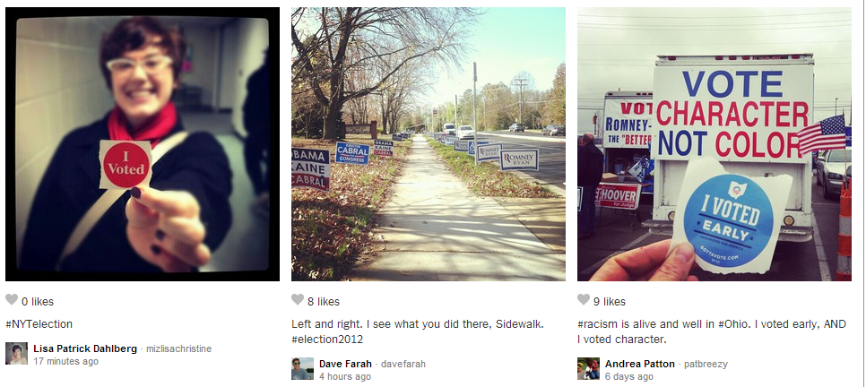
Who’s Going to Win, and How? Also, Instagram with feelings.
In addition to this excellent application showing all the different electoral routes for either Mitt Romney or Barack Obama to win today’s election, the Times has asked its readers to “Instagram the election,” and to submit a word that sums up their emotions on this election day. Check out the animated visualization showing the most commonly submitted words.
Keep Reading
Most Popular
Large language models can do jaw-dropping things. But nobody knows exactly why.
And that's a problem. Figuring it out is one of the biggest scientific puzzles of our time and a crucial step towards controlling more powerful future models.
The problem with plug-in hybrids? Their drivers.
Plug-in hybrids are often sold as a transition to EVs, but new data from Europe shows we’re still underestimating the emissions they produce.
Google DeepMind’s new generative model makes Super Mario–like games from scratch
Genie learns how to control games by watching hours and hours of video. It could help train next-gen robots too.
How scientists traced a mysterious covid case back to six toilets
When wastewater surveillance turns into a hunt for a single infected individual, the ethics get tricky.
Stay connected
Get the latest updates from
MIT Technology Review
Discover special offers, top stories, upcoming events, and more.