The Algorithm Expanding the Science of Color
The study of color is undergoing a revolution. Until now, color theory has been little more than a collection of ideas based loosely on science.
But the ability to analyze huge data sets of images using machine-vision algorithms is changing that. Suddenly it has become possible to study color and the way it is used in entirely different ways. For example, it is now easy to extract combinations of colors from one picture and paste them onto another.
But this process of color pasting is a blunt tool. It can replace one set of colors with another but it cannot compare these color palettes, decide how specific colors should be matched, or discover whether a palette is missing a color and replace it.
The problem is that there is no way of placing colors in order. And that makes it hard to compare palettes. So image specialists would dearly love to have a natural way to order colors extracted from images and so be able to compare them.
Enter Huy Phan at the Technical University of Denmark in Copenhagen and a couple of pals, who have found a way to do just that. Their technique is straightforward to implement and immediately leads to a new generation of enriched image filters that are far more flexible than those currently available.
The basic problem is simple to state: given the color palette from two images, what order should the colors appear in to make a meaningful comparison? By meaningful, the team means that colors describing the same objects should be comparable.
Phan and co tackle this as a kind of sorting problem. They first assess an image by plotting the position of the colors it contains—its palette—in a three-dimensional color “space” (every color can be thought of as a three-vector describing how it is composed from a mixture of red, green, and blue, for example).
They then measure the distance between each pair of colors in the palette. Finally, they use an algorithm to work out how to map one palette onto another with minimal distortion. Effectively, this algorithm finds clusters within each palette’s color space.
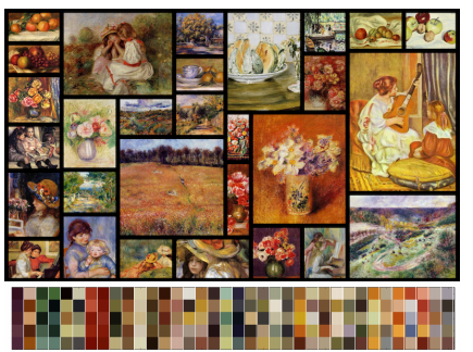
The data set they use is important. “We consider color palettes extracted from fine art collections, which we believe to be an abundant source of stylistic and unique color themes,” say Phan and co.
That also limits the subject matter, which is crucial. Henri Matisse often used deep reds and greens in his paintings, for example, while Maximilien Luce used strong blues and yellows to shade objects. But because these artists use broadly similar scenes (for example, divided into sky and land), the colors are comparable.
It means that the team can assume that similar clusters of colors describe similar objects. The algorithm then maps these clusters onto each other. In that way, it can take the coloring of sky in one image and apply the same set of colors to the sky in another image.
And because the transformation is applied to the whole space, it becomes straightforward to map any color from palette onto a corresponding color in the other palette.
That leads to a natural way to order colors. Phan and co do it by first specifying the number of colors that appear in each cluster. Phan and co use five as their standard example (higher numbers require significantly more computational resources).
The algorithm then finds the five colors in the first cluster, then in the second, third and so on. Ordering these clusters then allows the palettes in each image to be easily compared.
The method immediately leads to some interesting applications. For example, they create an application called Photo-style Explorer which acts like an Instagram filter but in a continuous color space. “Instead of choosing among a few predefined themes, one can freely surf a continuous space of possible photo colorizations to pick a preferred theme,” they say.
Another option is to recolor photos with different palettes in different parts of the image. So it is possible to use one palette to recolor the sky and another to recolor trees.
It also allows a better analysis of the color signatures of artists and for these signatures to be transferred to other images. So it becomes possible to quickly recolor a photograph using the Renoir’s color palette or Vincent van Gogh’s.
That’s interesting work which expands the way color can be used in modern images.
Ref: http://arxiv.org/abs/1703.06003: Color Orchestra: Ordering Color Palettes for Interpolation and Prediction
Keep Reading
Most Popular
Large language models can do jaw-dropping things. But nobody knows exactly why.
And that's a problem. Figuring it out is one of the biggest scientific puzzles of our time and a crucial step towards controlling more powerful future models.
The problem with plug-in hybrids? Their drivers.
Plug-in hybrids are often sold as a transition to EVs, but new data from Europe shows we’re still underestimating the emissions they produce.
Google DeepMind’s new generative model makes Super Mario–like games from scratch
Genie learns how to control games by watching hours and hours of video. It could help train next-gen robots too.
How scientists traced a mysterious covid case back to six toilets
When wastewater surveillance turns into a hunt for a single infected individual, the ethics get tricky.
Stay connected
Get the latest updates from
MIT Technology Review
Discover special offers, top stories, upcoming events, and more.