The Last 20 Inches: Data’s Treacherous Journey from the Screen to the Mind
In a world where bits travel at thousands of miles per second, the last 20 inches of the journey—those separating the screen from the user—are where communication stops.
I call this communication breakdown the 20 inches problem. It most greatly affects those who need to communicate the structured arrays of numbers we refer to colloquially as ”data.” Unlike data, text and video are not affected fatally by the last 20 inches of their journey because they travel the Web in packages that are explicit about how they will be rendered. Yet data travels the Web naked, separated from the algorithms that give it form and that people need to understand its meaning. This makes the design of visualization tools critical for the communication of the information that is hidden in data.
In Macro Connections—my research group at the MIT Media Lab—we cannot compete with the companies that transfer terabytes of data in milliseconds, but we can use our technical and artistic skills to speed up the last 20 inches of data’s treacherous journey.
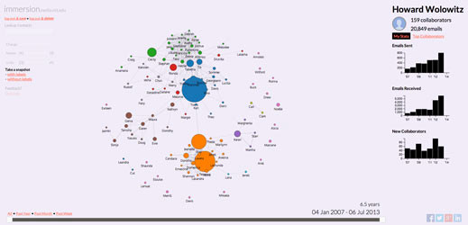
As a first example, consider e-mail. For much of the last 40 years, the interface of e-mail hasn’t changed much. What has changed is the feeling we get when we open our in-boxes. The joyful “you’ve got mail” of the 1990s evolved into the overwhelming “you’ve got s*%#loads of mail” of 2014. Yet there should be a better way to parse the flood. E-mails contain text, but also metadata with information about an e-mail’s sender, recipient, and time. The metadata in e-mails is being used almost entirely for operational purposes—making sure e-mails reach their recipient. Yet from a user interface perspective it could be used to generate a visual representation of the networks that people interact with, helping them improve their understanding of their e-mail interactions.
Last summer two of my students, Daniel Smilkov (@dsmilkov) and Deepak Jagdish (@dj247), released Immersion (immersion.media.mit.edu). Immersion flips the interface of e-mail by presenting users a picture of the social network they have weaved through years of e-mail exchanges, instead of the 20 e-mails they’ve received during the past hour. Immersion adds perspective by acknowledging that we use e-mail to interact with networks of people, rather than stacks of messages. It helps users see the networks they have constructed through years of interactions, providing context in a media that for many has become overwhelming.
The 20 inches problem doesn’t affect e-mail alone. Another example is international trade data containing information about the evolution of markets and the development of economies. This is very valuable data, but it’s still hard to access and understand.
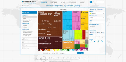
Solving the 20 inches problem for international trade data was the master’s thesis of another of my students, Alex Simoes (@ximoes). Alex created the Observatory of Economic Complexity (atlas.media.mit.edu). The Observatory is a tool allowing people to access data for each country, product, and destination, through millions of interactive visualizations. The Observatory receives more than 100,000 monthly visitors, revealing that these visualizations are essential to democratize access to data that was otherwise hidden in the inaccessibility of files.
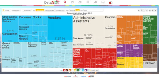
After graduating from MIT, Alex, together with Dave Landry (@davelandry) and I, built DataViva (dataviva.info), a site that opened up data for the entire Brazilian economy through more than 100 million interactive visualizations. DataViva is now being used by people in the private and public sector in Brazil to understand the development of the economy of each of the more than 5,000 Brazilian municipalities. As an official government website, DataViva also illustrates how visualizations can be used to open up government data in a way that is more user friendly than the .csv downloads that abound. This innovation greatly improves upon the traditional approach to open public data, which has mostly eschewed visualizations.
Yet the world is not made only of economic and personal metadata. There is information trapped in narratives that could be liberated with the development of the appropriate tools. One example of this is data on cultural production. Consider the United States. The Observatory reduces the U.S. to products, such as soybeans, aircraft, and cars, which is better than reducing it to a GDP number, but is still not good enough. This is because the Observatory is limited by international trade data that knows nothing about U.S. cultural products, such as the popularity of Elvis or the steps of Neil Armstrong.
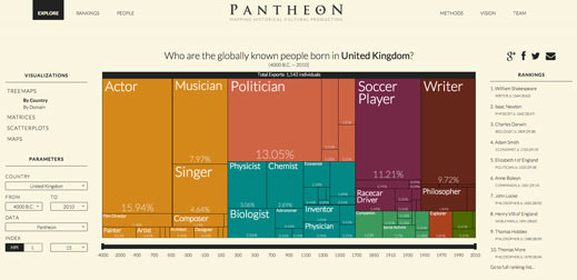
During the last couple of years, together with Amy Yu (@mangomochi86), Kevin Hu (@kevinzenghu), and a fantastic team of students and colleagues, we collected data on nearly 12,000 historical biographies to create Pantheon (http://pantheon.media.mit.edu). Pantheon visualizes the cultural production of countries as proxied by the biographies of characters whose celebrity has broken the barriers of space, time, and language. For example, Pantheon tells us the historical composition of the U.K.’s cultural production. You can think of this as the components of a country’s Global Cultural Product, or GCP, instead of GDP. In the case of the U.K., Pantheon tells us that the U.K. is among the most diverse countries in term of cultural production and that its most celebrated cultural exports are the contributions of Shakespeare, Newton, Darwin, and Adam Smith.
The rise of big data has produced a massive gap in our ability to understand the information that our species is accumulating, in part because of a lack of tools that can help that data travel the 20 inches currently separating minds from machines. The development of visualization tools like the ones I presented here help liberate millions of data slices in visual form, empowering humans to do what they do best: get creative and weave sequences of visualizations in search of new understanding.
Keep Reading
Most Popular
Large language models can do jaw-dropping things. But nobody knows exactly why.
And that's a problem. Figuring it out is one of the biggest scientific puzzles of our time and a crucial step towards controlling more powerful future models.
The problem with plug-in hybrids? Their drivers.
Plug-in hybrids are often sold as a transition to EVs, but new data from Europe shows we’re still underestimating the emissions they produce.
Google DeepMind’s new generative model makes Super Mario–like games from scratch
Genie learns how to control games by watching hours and hours of video. It could help train next-gen robots too.
How scientists traced a mysterious covid case back to six toilets
When wastewater surveillance turns into a hunt for a single infected individual, the ethics get tricky.
Stay connected
Get the latest updates from
MIT Technology Review
Discover special offers, top stories, upcoming events, and more.