Yahoo’s Weather App Has No “Cool” Interactions–And That’s Amazing
I can’t believe I’m about to say this, but Yahoo’s new weather app for iOS is great. Is it “innovative”? No. Well, actually it is. Its innovation is in being as non-“innovative” in its interaction design as possible. No fussy gestures, no neato animations, no infographics to “explore”. No “interactivity” at all, really. It’s more a piece of graphic design than interactive design–and my God, I wish more apps were just like it.
I read two things recently that really changed my whole worldview about most of the software I interact with on a daily basis. One was an article in The Onion, and another was a quasi-academic essay written before iOS-style “apps” even existed. Their shared point–which flies in the face of some of the most basic assumptions that software designers have–is this: interaction sucks and we shouldn’t have to do it. Why? Because what we want out of most software, simply, is information. Unless it’s a game or a tool for creating something else, we don’t want to “use” software like a machine, pulling a bunch of levers and telling it what to do. We just want to read it.
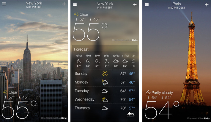
So what does Yahoo Weather “do”? Not much. It presents you with a readable graphic containing the information you opened the app in order to read. It just sits there. It might as well be paper. And guess what? That’s exactly what I want. The only way it could be better–that is, even less interactive–is if I didn’t even have to launch it, and the current temperature/condition were graphically displayed right on the little rounded square icon. Unfortunately, iOS doesn’t let any third party apps do this.
iOS’s built-in weather app does offer this kind of read-only, non-interactive experience. But its static graphics aren’t as well designed to deliver the information–there’s clutter. Yahoo’s app fills the screen with only the information I am most likely to want, in a visual hierarchy that makes reading it ultra-easy: a giant Fahrenheit number numerically represents the temperature while a full-bleed photo of my hometown graphically/emotionally represents it as well, and smaller typography adds information about today’s highs and lows. Two tiny bits of UI chrome (or “administrative debris”, to use Edward Tufte’s term) are tucked into the upper right corners of the screen, far away from my thumbs and undistracting to the eye. I haven’t even bothered to touch them to see what they do. Why would I? I don’t want to “interact” with this app in the first place, and its graphic design doesn’t force me to.
The only interactivity in Yahoo’s app comes from swiping “down” in the content to reveal additional information–that is, more well-designed, static graphics arranged in a hierarchy that minimizes the effort of “parsing” as much as possible. But at least the metaphor for this simple interaction makes sense: I’m “drilling down”, screen by screen, to reveal progressively finer-grained detail in the weather information if I want it. Most times, I won’t.
Yahoo’s app could’ve been designed even more aggressively to avoid interaction: some of the open space on that first screen–currently occupied by eye-candy images from Flickr, in a neat bit of company synergy–could surely be exploited to deliver some of the hourly-forecast information that is currently “demoted” to the next screen down. Those bits of information–what is the weather now, and what can I expect throughout the day–are all I want, 99% of the times I check the weather. Ideally, I should have to perform no UI manipulations whatsoever in order to read the information I seek. This would be difficult for any static graphic design to accomplish. But the ability of software to act as “magic ink”, as Bret Victor calls it–to dynamically generate “context sensitive” graphic designs that anticipate my demands–means that implementing this kind of “perfectly” interaction-less system isn’t necessarily impossible.
Yahoo’s app is already getting a lot of plaudits for being pretty, and that it certainly is. But prettiness is just icing on the cake. What’s great about this app is that it’s designed for reading, not “interaction”–it’s a self-assembling text, not a machine requiring manual operation. How many other apps are really just texts masquerading as machines, and wasting our time in the process? Charles Eames once said, “innovate as a last resort.” When so much “innovation” in software translates into foisting unnecessary interactions upon us, I wish more app designers would consider his advice.
Keep Reading
Most Popular
Large language models can do jaw-dropping things. But nobody knows exactly why.
And that's a problem. Figuring it out is one of the biggest scientific puzzles of our time and a crucial step towards controlling more powerful future models.
The problem with plug-in hybrids? Their drivers.
Plug-in hybrids are often sold as a transition to EVs, but new data from Europe shows we’re still underestimating the emissions they produce.
Google DeepMind’s new generative model makes Super Mario–like games from scratch
Genie learns how to control games by watching hours and hours of video. It could help train next-gen robots too.
How scientists traced a mysterious covid case back to six toilets
When wastewater surveillance turns into a hunt for a single infected individual, the ethics get tricky.
Stay connected
Get the latest updates from
MIT Technology Review
Discover special offers, top stories, upcoming events, and more.