Los Angeles Maps Electricity Use at the Block Level
Most buildings waste energy but how inefficient one building is compared to others is difficult to know. At a city level, choosing which buildings are ripe for efficiency upgrades is even harder.
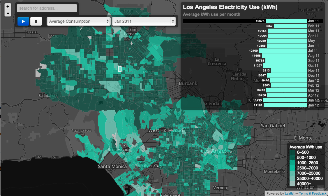
The University of California at Los Angeles today published a map that brings some clarity to how the city uses electricity, block by block.
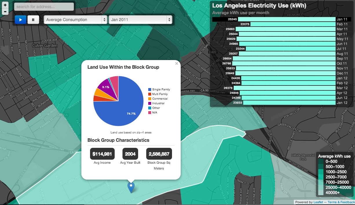
For consumers, the interactive map shows how each block compares to others and consumption patterns by season. But the Web app is more directly aimed at the municipal utility, the Los Angeles Department of Water and Power (LADWP), and city planners. The map overlays census and land use information so people can see how income levels affect electricity use and the difference between single family, multi-family, and commercial buildings. Privacy is protected by only showing data at the block level rather than individual buildings.
With the data, the utility could develop more finely tuned programs to improve efficiency, such as retrofits targeted at high energy users or low-income neighborhoods, says project manager Stephanie Pincetl, a professor at UCLA’s Institute of the Environment and Sustainability. It could also shed light on how buildings of a certain age perform and be combined with other data sources, such as projections for high heat days from climate change, she added.
The application is a prime example of how data visualizations can bring some order to understanding building energy. In the U.S., about 40 percent of energy (not just electricity) is consumed in buildings. Some experts estimated that between 30 percent and 50 percent is wasted. Columbia University last year did a similar mapping project to shed some light on the dynamics of energy use and to inform policies and foster the exchange of ideas.
UCLA was able to get electricity usage data from the municipally owned utility. Going forward, the group intends to map different regions in California served by private utilities through an NDA, says Pincetl. Providing this sort of detail on building efficiency may pose a conflict for utilities whose business is predicated on selling more power because very targeted efficiency programs can be developed, she says.
But utilities and building owners in many places may need to act anyway: many states and cities have energy-efficiency standards and data visualizations can shed a lot of light on where the low-hanging fruit is.
Keep Reading
Most Popular
Large language models can do jaw-dropping things. But nobody knows exactly why.
And that's a problem. Figuring it out is one of the biggest scientific puzzles of our time and a crucial step towards controlling more powerful future models.
The problem with plug-in hybrids? Their drivers.
Plug-in hybrids are often sold as a transition to EVs, but new data from Europe shows we’re still underestimating the emissions they produce.
How scientists traced a mysterious covid case back to six toilets
When wastewater surveillance turns into a hunt for a single infected individual, the ethics get tricky.
Google DeepMind’s new generative model makes Super Mario–like games from scratch
Genie learns how to control games by watching hours and hours of video. It could help train next-gen robots too.
Stay connected
Get the latest updates from
MIT Technology Review
Discover special offers, top stories, upcoming events, and more.