Typeface aficionados perceive major differences between fonts that look broadly similar to the rest of us. Now an MIT study suggests that such differences might be a vital safety matter in automobiles.
In recent tests, researchers with MIT’s AgeLab found that dashboard displays using the more open and differentiated lettering found in the “humanist” family of typefaces are easier for people to read quickly than displays using the more uniform and tightly spaced letters of the “square grotesque” style. Male drivers, in particular, can process messages in humanist lettering about 10 percent faster, on average—cutting down the time drivers spend with their eyes away from the road.
“We’re not advocates of putting more information in front of the driver,” says Bryan Reimer, a research scientist at MIT’s AgeLab and the lead author of a paper on the findings. The question, Reimer says, is “How do we present the information that we do need in front of the driver in the most effective manner possible?”
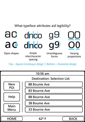
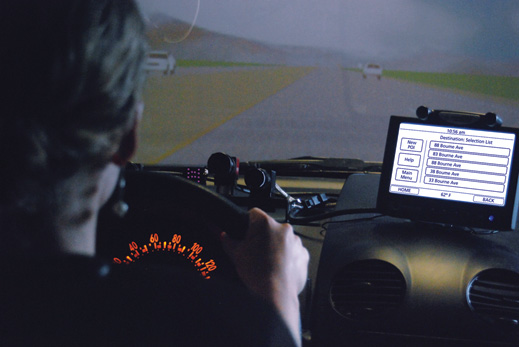
The researchers performed two separate tests on drivers between 36 and 74 years of age, using the automobile simulator in MIT’s AgeLab. Reimer suggests that the humanist style seems easier to read quickly for multiple reasons. The narrower shape of the characters leads to greater relative spacing between them, making individual letters easier to distinguish. And the varying heights of the letters, and the distinctive tails and bars extending above and below the bulk of the character shape, “present information in a manner that can be more quickly decoded,” he adds.
The humanist style encompasses a variety of typefaces, such as Clearview, Veranda, and Frutiger, the one used in the study. Grotesque typefaces include Franklin Gothic, Helvetica, and Eurostile, which was the other typeface the researchers tested. To be sure, Reimer notes, the study does not render judgment on the value of typeface styles more generally. “What’s optimal for a piece of paper or e-reader may not be optimal in a glance-based environment in the car,” he says. “Immersive reading is far different than glancing at information for a few seconds.”
Although the researchers have not yet developed tests aimed strictly at older drivers, Joseph F. Coughlin, director of the MIT AgeLab and one of 12 coauthors of the study, suggests that this kind of issue will become more important to an aging population. “Font and presentation of information [are] going to become more critical in all domains of life,” Coughlin says.
Keep Reading
Most Popular
Large language models can do jaw-dropping things. But nobody knows exactly why.
And that's a problem. Figuring it out is one of the biggest scientific puzzles of our time and a crucial step towards controlling more powerful future models.
How scientists traced a mysterious covid case back to six toilets
When wastewater surveillance turns into a hunt for a single infected individual, the ethics get tricky.
The problem with plug-in hybrids? Their drivers.
Plug-in hybrids are often sold as a transition to EVs, but new data from Europe shows we’re still underestimating the emissions they produce.
Stay connected
Get the latest updates from
MIT Technology Review
Discover special offers, top stories, upcoming events, and more.