Why Power Users Hate Fancy Web Design
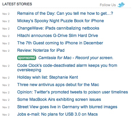
The homepage of MacWorld.com is almost confrontationally un-designed. Instead of the usual visual vocabulary of “good” Web design – variably-sized images, thumbnails, carefully apportioned white space, one-pixel lines, typefaces of various weights – the homepage is dominated by this:

That’s deliberate, MacWorld editor in chief Jason Snell told me via e-mail:
“When we bought the site MacCentral in 1999 its home page looked like that. It’s a legacy of that.”
His readers, he says, have been trained to expect a straight river of news – no embellishment, no frills, nothing but the text itself. Their preference was so strong that the audience was utterly immune to attempts at a more accessible redesign.
“When we moved that list to a lower-down news index, that became the biggest traffic page on the site instead of the home page. They didn’t even like it when we added thumbnails and summary blurbs.”
Snell says the page has looked more or less like that for a decade, which means it predates the widespread use of RSS readers and other sites with stripped-down designs, such as Reddit. Now that things like Readability and Instapaper are dissolving all the bells and whistles off of every other kind of content, as Dylan Tweney points out, it’s worth asking whether or not what we’ve come to accept as good Web design accomplishes anything genuinely useful for a website’s best customers – the ones who obsessively check it throughout the day, the ones who read every word of an article, the ones who are most engaged with a site’s content.
It could be a backlash against intrusive advertisements (think of the rise of ad blockers) and, just as importantly, the internal promotional widgets that function just like advertisements. It could also be that text, or language - unlike more visual media - must in the end be processed sequentially. Getting a user to move through a sequence of items in a particular order can be accomplished by scattering those items across a page and then catching the user’s eye, but also simply by putting them in the order the content creator intends.
Readers are apparently drawn to this level of simplicity; Snell reports that MacWorld’s homepage gets “massive traffic,” and a quick glance at its showing on Compete.com confirms it.
“Saying we designed it to be like a feed reader probably gets it backward. We trained our home-page-oriented readers to use it as their feed for Apple news before feed readers were even popular, and now it’s hard to train them to do anything else. They want what they want.”
Keep Reading
Most Popular
Large language models can do jaw-dropping things. But nobody knows exactly why.
And that's a problem. Figuring it out is one of the biggest scientific puzzles of our time and a crucial step towards controlling more powerful future models.
How scientists traced a mysterious covid case back to six toilets
When wastewater surveillance turns into a hunt for a single infected individual, the ethics get tricky.
The problem with plug-in hybrids? Their drivers.
Plug-in hybrids are often sold as a transition to EVs, but new data from Europe shows we’re still underestimating the emissions they produce.
Stay connected
Get the latest updates from
MIT Technology Review
Discover special offers, top stories, upcoming events, and more.