1.
Just When I Thought I Was Out, They Pull Me Back In
It was the kind of brief most freelancers dream of: Technology Review, the company I’d left nine years earlier in order to start my own studio, was under new management—and was in the midst of transforming itself from your standard magazine-with-a-website operation into a digitally oriented global media company, with platforms online, in print, on mobile, and with in-person events around the world. The onset of this reinvention1 had been rapid and had proceeded largely ad hoc, with designs created on-the-fly by disparate teams of staffers, freelancers, and temporary help, much of it without central coordination or concern for visual consistency. As a result, the brand2 had begun to feel like a garden badly in need of tending. Sure, some corners looked great; other parts just needed some pruning; but there were also whole sections that needed to be completely torn out and replanted.
Technology Review needed a designer to help them establish a visual system that was strong in tone, resilient enough to work both in print and digital formats, and consistent across all platforms in which its audiences were engaged. It needed an identity commensurate with its ambitions—and worthy of its mission.
My proposal began with these general principles:
We must avoid overt efforts to illustrate technology with our design choices. The results are too often trite. Neither should we be content with a design approach suited to a conventional news organization that “happens to be about technology.” That’s much too generic. The optimal approach is something more nuanced; our design must embody the ideals of technology by demonstrating intelligence, elegance, and efficiency while promoting experiences of pleasure in possession and use.
I got the gig—and a job offer. And now after 10 months of thinking, sketching, typesetting, and debating3, I’m happy to finally share the results.
——–
1. With the ad sales market in the tank and a growing lack of interest among readers in actually coughing up cash for content, the publishing consultant’s trope “Evolve or Die” had become a guiding principle.
2. I hate this word, but will use it here as a lazy stand-in to refer to the collection of impressions, memories, and anthropomorphized ideas a given audience has toward an institution, product, or service.
3. This is totally a euphemism.
2.
Not Your Parents’ Helvetica
Though big changes were needed, it was important that the new design system stay true to the spirit of the Technology Review everyone knows and loves (and obsesses about). So we began by considering the graphic history of MIT in general and Technology Review specifically, appropriating the best ideas from the past and updating them for the modern media environment.
We paid special attention to the midcentury work done in the MIT Office of Publications. The innovative typographic designs of Muriel Cooper, Ralph Coburn, and Jacqueline Casey smartly merged European formal sophistication with American4 vitality – and defined the look of MIT in the Modern era.


The designers working during this time were tireless in their inquiry into the expressive possibilities of Helvetica. This encouraged us to take a fresh look at the typeface.

In fact, for nearly a decade, Helvetica was the only typeface used in Technology Review. So when we began considering typefaces for our own designs in print and online, Christian Schwartz’s Neue Haas Grotesk, a meticulous digital restoration of Helvetica’s original designs, was the natural choice.

Fifty years ago, this institution occupied a place at the vanguard of American graphic design. We intend to reclaim that heritage.
——–
4. I don’t mean to sound jingoistic here. I just find most European Modernism to be pompous, precious, and ironically anti-democratic. But we find wit, irreverence, and surprise in the work of Paul Rand, who was one of Muriel Cooper’s early mentors. It’s clear that Cooper approached her work with a sense of play (see her “Information Landscapes” here—one of the first demonstrations of moving type—to see what I mean); I can’t help but imagine she fostered this joy among her staff and, later, her students at the MIT Media Lab.
3.
The Question Concerning Technology Review
As you may have noticed, the most dramatic change in the new identity isn’t visual so much as verbal5.
Founded at MIT in 1899, this enterprise derives its authority from the world’s foremost technology institution. Our affiliation with our owner is one we’re proud of—and one we take very seriously. It seemed obvious that this affiliation be not only affirmed, but celebrated.
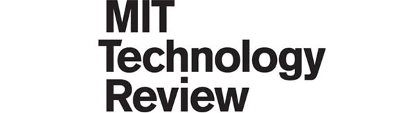
Our logo is based on a modified version of Akzidenz Grotesk, the typeface used in the MIT logo, so the two marks bear a sort of family resemblance. We refined a number of characters to get the visual rhythms right, but among the logo’s more distinctive details is the notched capital T. The horizontal stroke of that character (called a crossbar) was designed to terminate at a 14-degree angle, as if it were written with a pen. This was done in part to foster a sense of circular movement within the mark:

And it gives us a distinctive character to use as our app badge and social media avatar6. It also works nicely as the endnote at the close of a print feature:

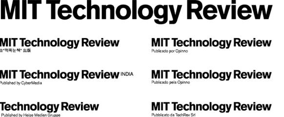
International editions of MIT Technology Review in print and online also bear this logo, which is modified by a simple signature line identifying each of our regional publishing partners:

The German language edition of MIT Technology Review is the only exception; “mit” is German for “with,” so rather than redraw the logo with initials in the acronym – a practice verboten7 by the institute’s brand standards – the German edition will include a tagline that reads “M.I.T.- Magazin für Innovation,” or, “MIT’s magazine of innovation.”
And because the stacked logo will scale only so small before it becomes an illegible mess, we devised an alternate version for use in difficult formats, like onscreen navigation bars and PowerPoint footers:
The stacked logo was designed to be versatile enough that it could function as a modifier in each of our extended brands. When we place it in a square-shaped bullet and apply a simple color-coding rule, the logo serves as an element in a modular identity system that includes:
Annual national lists

Annual international lists

Annual regional lists

Annual events

Annual regional events

When you add up all the color options and scaling alternates, the MIT Technology Review identity system comprises 242 distinct graphic marks8.
5. This is the third logo the enterprise has worn since 2005; it was important that a.) we get it right this time, and b.) that it seem like the natural next step in an inevitable progression.
6. It worked out okay, but this symbol is actually a compromise. My original idea was something much more ambitious – I was determined that a digitally oriented media company should get a digitally oriented logo. So I came up with a stylized TR, animated like the original MTV logo. It proved impractical for technical and aesthetic reasons – not the least of which was our eventual decision to include MIT as part of the official name – but here’s what it would have looked like:
7. So to speak.
8. Triple that number when you include all of the file formats: eps, jpeg, and Bitmap TIFF.
4.
Kissing Frogs
Nailing down a final design requires that we produce, consider, and eliminate as many different concepts as possible. As Dean Kamen put it during a Technology Review photoshoot in 2002, you have to kiss a lot of frogs before you find your prince.
One of the challenges in devising a design system for a digitally oriented media company that places a high priority on print but also spends lots of time staging events is, there are no models to follow. We’re sort of making this up, feeling our way through it, experimenting a whole bunch, and likely getting lots of it wrong along the way. I’m not smug enough to think we’ll have the last word on what a post-print media company is, but I’m confident that we’ll make some progress in answering the question: what does it mean to produce beautiful, literate, useful information that combines the best of print, digital, and live media for a global audience?
Keep Reading
Most Popular
Large language models can do jaw-dropping things. But nobody knows exactly why.
And that's a problem. Figuring it out is one of the biggest scientific puzzles of our time and a crucial step towards controlling more powerful future models.
The problem with plug-in hybrids? Their drivers.
Plug-in hybrids are often sold as a transition to EVs, but new data from Europe shows we’re still underestimating the emissions they produce.
Google DeepMind’s new generative model makes Super Mario–like games from scratch
Genie learns how to control games by watching hours and hours of video. It could help train next-gen robots too.
How scientists traced a mysterious covid case back to six toilets
When wastewater surveillance turns into a hunt for a single infected individual, the ethics get tricky.
Stay connected
Get the latest updates from
MIT Technology Review
Discover special offers, top stories, upcoming events, and more.